
A ten-month brief to rebuild the visual identity for Alquimia Interior, a school of consciousness. Three brands sit under one school, each with its own audience, and I brought them into a single coherent system that any team can run.
The brief
Three brands sharing one school, each speaking to a different audience, with a scattered visual presence that no longer matched the depth of the programme.
The response
Ten months rebuilding the identity from strategy to application: one brand family with shared logic and its own character per brand, ready for any team to run.
Refreshing the brand and bringing visual coherence to three brands.
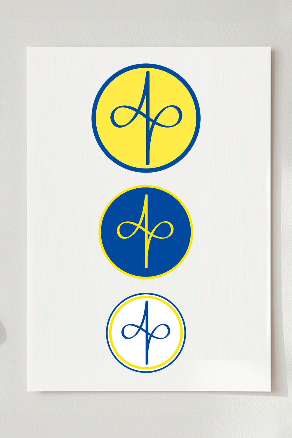
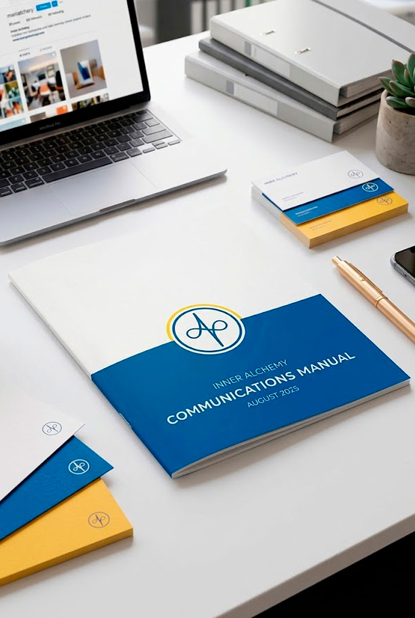
A vertical infinity: alignment that creates inner infinity. Framed by a blue circle and a golden thread, both symbols of protective blessing.
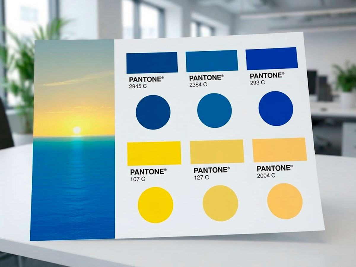
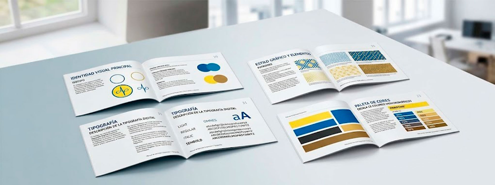
Two families, two meanings. The blues (Pantone 2945, 2384 and 293 C) stand for the Protective Blessing: a field of consciousness that safeguards the integrity of the work and of everyone taking part in it. The yellows (Pantone 107, 127 and 2004 C) refer to the sun, the universal source of warmth and light that dispels darkness: the core of Consciousness, the origin of all creation.
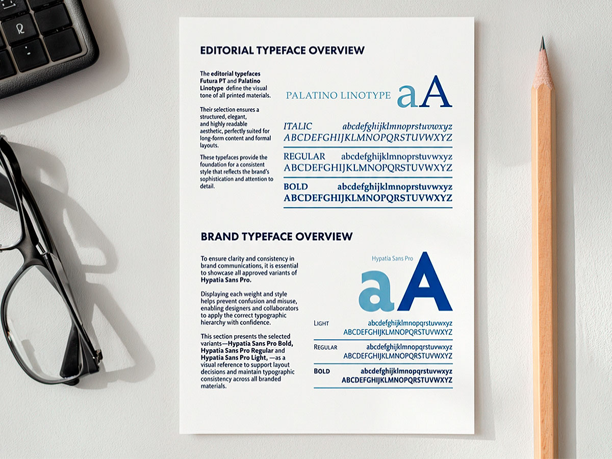
Hypatia Sans Pro in three weights — Light, Regular and Bold — the corporate typeface across the whole visual system.
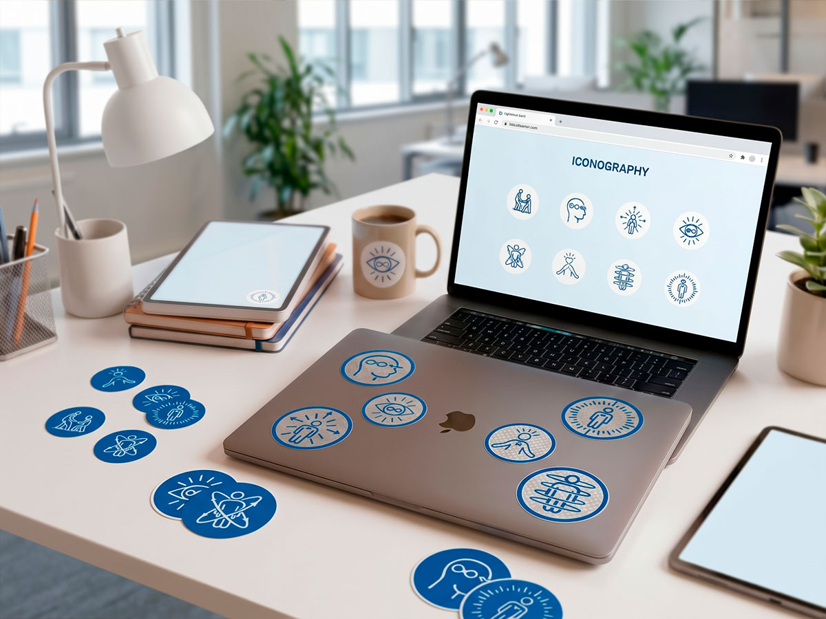
Nine custom line icons for the pillars of the programme, created to keep the intention and energy of the work alive within the system.
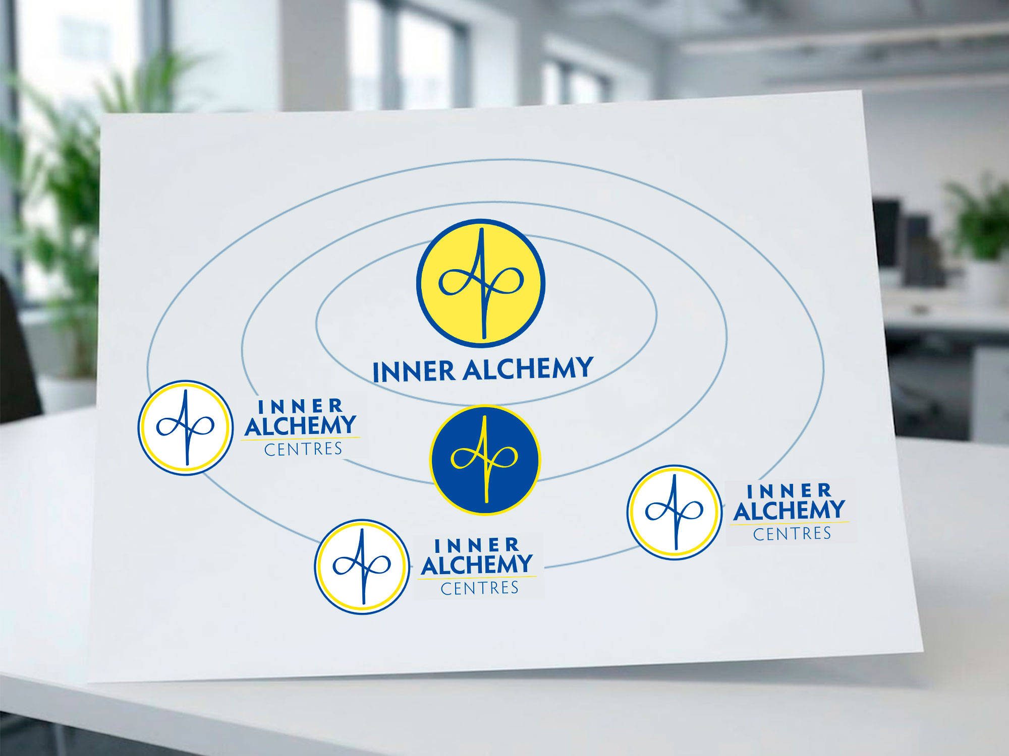
One isotype for every brand; only the colour combination changes — yellow, blue or white with a golden ring. Inner Alchemy, Inner Alchemy Centres and a third brand under NDA share the same logic.
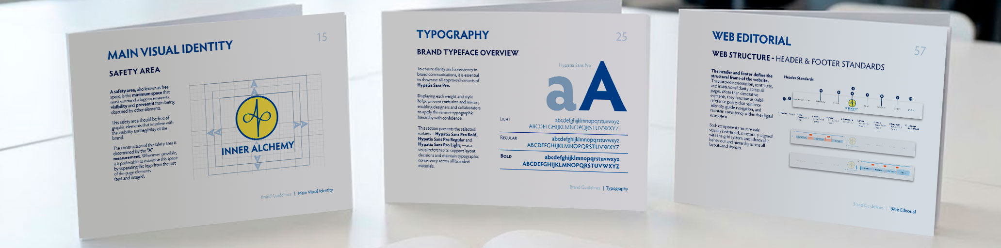
The grid doesn't decorate, it structures: it's the invisible skeleton of the system.
Full visual identity for Inner Alchemy, Inner Alchemy Centres and a third brand under NDA, each with its own character inside the shared system.
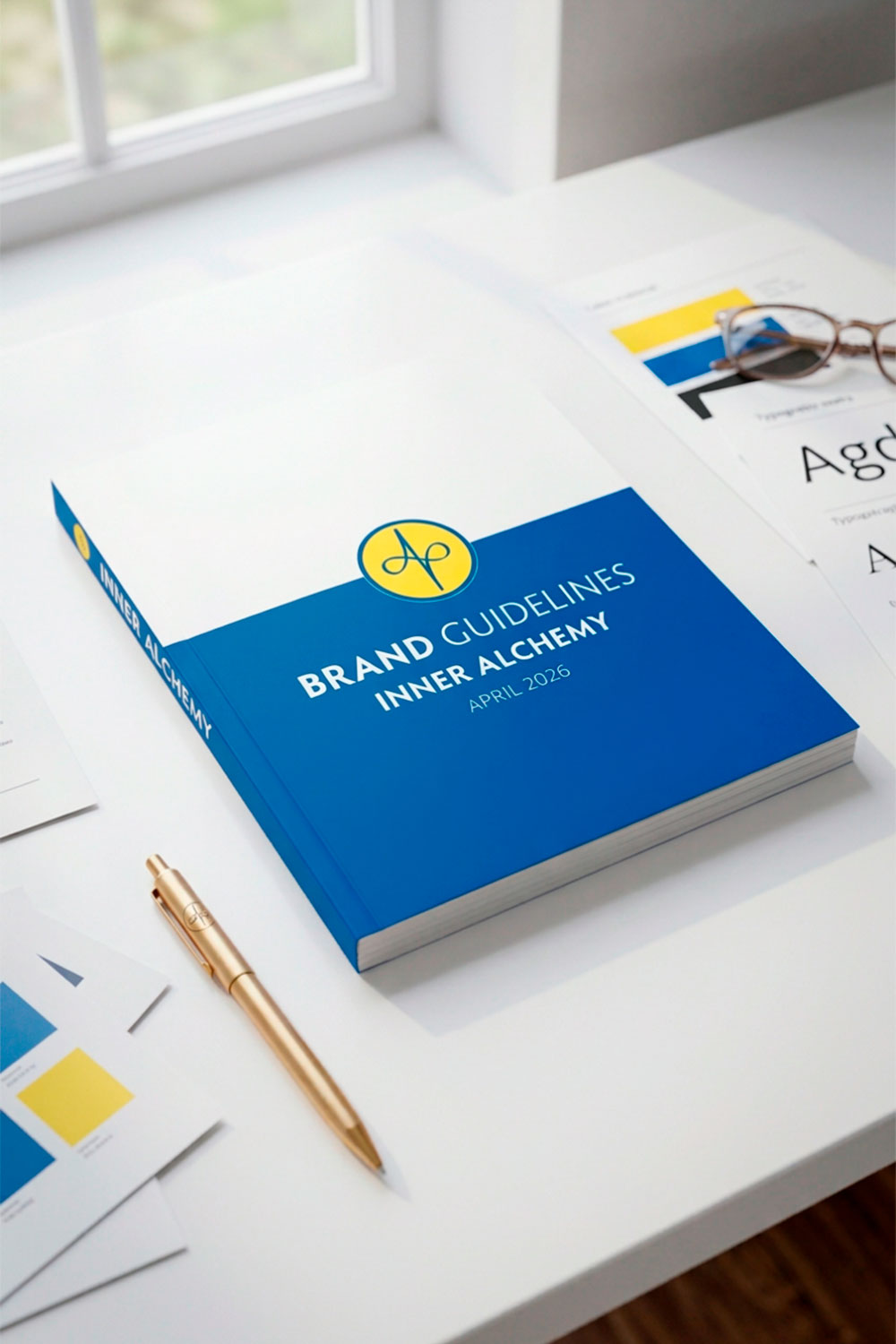
An 80-plus page corporate manual: logo use, colour, typography, iconography, editorial system and applications for each brand.
Nine custom outline icons for the programme's pillars — service, awakening, consciousness, transformation and more. Delivered in SVG and PNG.
Official completion certificates, fully branded, print-ready and adaptable to each programme.
Tone of voice, content formats and social media templates, so every team posts with the same voice and look.
A full UX wireframe for the school's site: information architecture, page structure and content hierarchy.
Before
The original brand was built for a single purpose and a single brand: Alquimia Interior, with country variants (Argentina, Paraguay, Europe, Brazil). It wasn't designed to live alongside other brands, so it had to be updated to fit the new system.
After
A unified brand system that gives coherence to the brand's values and opens a shared space to accompany each person, from their first contact through to deeper study and practice.
Part of this project is under a signed NDA: one of the three brands and all course information are not shown. The full work is available on request.