A ten-month brief to rebuild the visual identity for Zulma Reyo's School of Consciousness. Three brands sit under one school, each with its own audience, and I brought them into a single coherent system that any team can run.
The brief
Three brands sharing one school, each speaking to a different audience, with a scattered visual presence that no longer matched the depth of the programme.
The response
Ten months rebuilding the identity from strategy to application: one brand family with shared logic and its own character per brand, ready for any team to run.
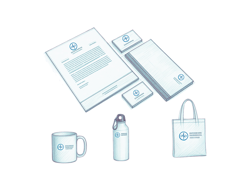
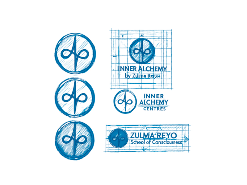
Full visual identity for Inner Alchemy, School of Consciousness and The Centres, each with its own character inside the shared system.
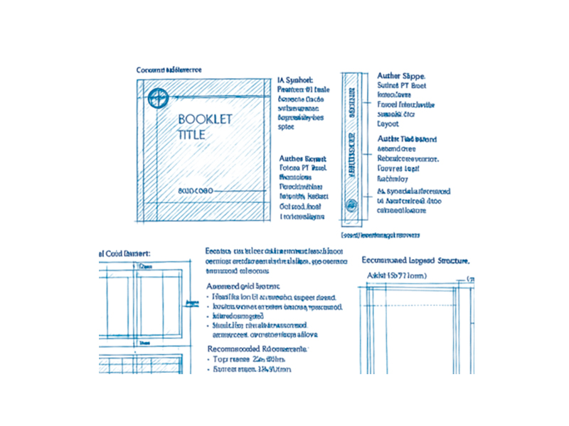
An 80-plus page corporate manual: logo use, colour, typography, iconography, editorial system and applications for each brand.
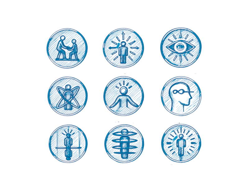
Nine custom outline icons for the programme's pillars — service, awakening, consciousness, transformation and more. Delivered in SVG and PNG.
Official completion certificates, fully branded, print-ready and adaptable to each programme.
Course schedules for print and digital, with a clear information hierarchy and one visual language across every format.
A full UX wireframe for the school's site: information architecture, page structure and content hierarchy.
Images shown at reduced fidelity under NDA. The full work is available on request.